Lab05_WriteUp
Contents
Question 1
Question 1a
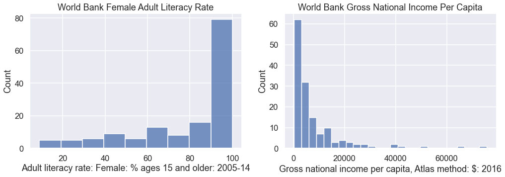
Suppose we wanted to build a histogram of our data to understand the distribution of literacy rates and income per capita individually. We can use countplot in seaborn to create bar charts from categorical data.
| |
Question 1b
In the cell below, create a plot of literacy rate and income per capita using the distplot function. As above, you should have two subplots, where the left subplot is literacy, and the right subplot is income. When you call distplot, set the kde parameter to false, e.g. distplot(s, kde=False).
Don’t forget to title the plot and label axes!
Hint: Copy and paste from above to start.
| |
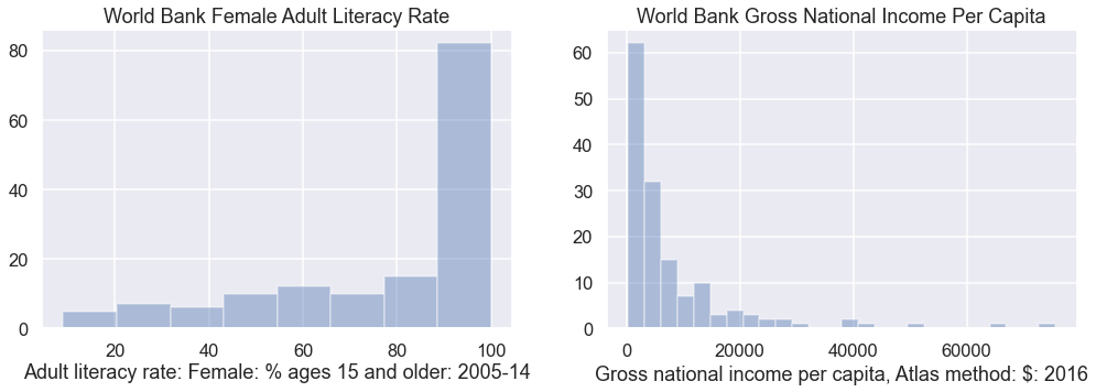
You should see histograms that show the counts of how many data points appear in each bin. distplot uses a heuristic called the Freedman-Diaconis rule to automatically identify the best bin sizes, though it is possible to set the bins yourself (we won’t).
In the cell below, try creating the exact same plot again, but this time set the kde parameter to False and the rug parameter to True.
| |
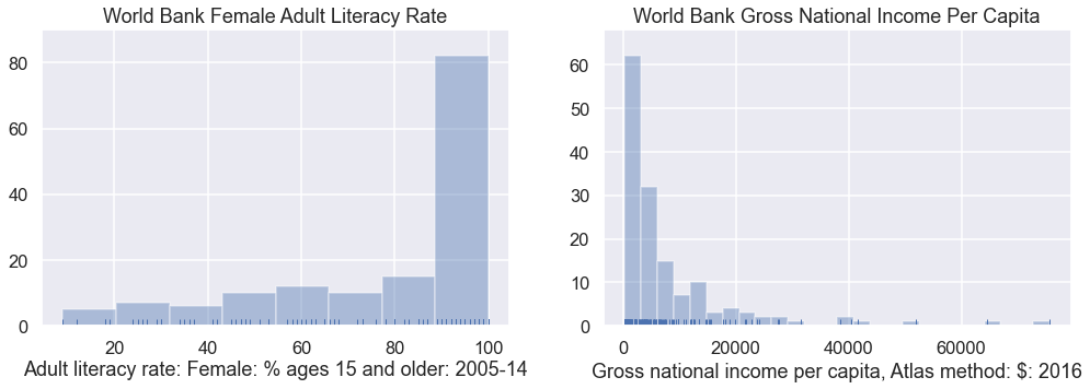
Above, you should see little lines at the bottom of the plot showing the actual data points. In the cell below, let’s do one last tweak and plot with the kde parameter set to True.
| |
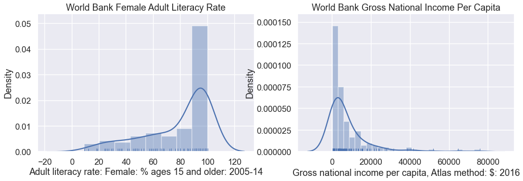
You should see roughly the same histogram as before. However, now you should see an overlaid smooth line. This is the kernel density estimate discussed in class.
Observations:
You’ll also see that the y-axis value is no longer the count. Instead it is a value such that the total area under the KDE curve is 1 and the total area in the histogram is 1. The KDE is a smooth estimate of the distribution of the given variable.
The KDE is just an estimate, as is the histogram. Notice that it assigns a large fraction of its area to values in the 100-120% literacy rate. This is definitely an impossibility.
We’ll talk more about KDEs later in this lab.
Question 1c
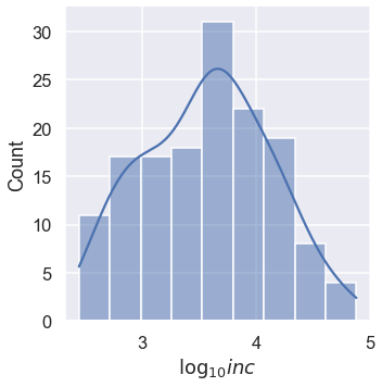
Looking at the income data, it is difficult to see the distribution among low income countries because they are all scrunched up at the left side of the plot. The KDE also has a problem where the density function has a lot of area below 0.
Transforming the inc data logarithmically gives us a more symmetric distribution of values. This can make it easier to see patterns.
In addition, summary statistics like the mean and standard deviation (square-root of the variance) are more stable with symmetric distributions.
In the cell below, make a distribution plot of inc with the data transformed using np.log10 and kde=True. Be sure to correct the axis label using plt.xlabel. If you want to see the exact counts, just set kde=False.
| |
Question 1d
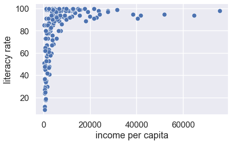
If we want to examine the relationship between the female adult literacy rate and the gross national income per capita, we need to make a scatter plot.
In the cell below, create a scatter plot of untransformed income per capita and literacy rate using the sns.scatterplot function. Make sure to label both axes using plt.xlabel and plt.ylabel.
| |
We can better assess the relationship between two variables when they have been straightened because it is easier for us to recognize linearity.
In the cell below, create a scatter plot of log-transformed income per capita against literacy rate. Make sure to label both axes using plt.xlabel and plt.ylabel.
| |
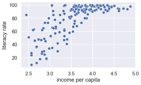
This scatter plot looks better. The relationship is closer to linear.
We can think of the log-linear relationship between x and y, as follows: a constant change in x corresponds to a percent (scaled) change in y.
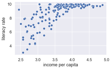
We can also see that the long left tail of literacy is represented in this plot by a lot of the points being bunched up near 100. Try squaring literacy and taking the log of income. Does the plot look better?
| |
Choosing the best transformation for a relationship is often a balance between keeping the model simple and straightening the scatter plot.
Question 2a
As mentioned above, the kernel density estimate (KDE) is just the sum of a bunch of copies of the kernel, each centered on our data points. The default kernel used by the distplot function (as well as kdeplot) is the Gaussian kernel, given by:
$$\Large K_\alpha(x, z) = \frac{1}{\sqrt{2 \pi \alpha^2}} \exp\left(-\frac{(x - z)^2}{2 \alpha ^2} \right) $$
| |
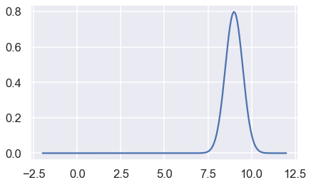
For example, we can plot the Gaussian kernel centered at 9 with $\alpha$ = 0.5 as below:
| |
Question 2c
In your answers above, you hard-coded a lot of your work. In this problem, you’ll build a more general kernel density estimator function. Implement the KDE function which computes:
$$\Large f_\alpha(x) = \frac{1}{n} \sum_{i=1}^n K_\alpha(x, z_i) $$
Where $z_i$ are the data, $\alpha$ is a parameter to control the smoothness, and $K_\alpha$ is the kernel density function passed as kernel.
| |