Lab04_WriteUp
Contents
Question 1
Question 1a
Above, it seems like OFFENSE is more specific than CVLEGEND, e.g. “LARCENY” vs. “THEFT FELONY (OVER $950)”. If you’re unfamiliar with the term, “larceny” is a legal term for theft of personal property.
To get a sense of how many subcategories there are for each OFFENSE, set calls_by_cvlegend_and_offense equal to a multi-indexed series where the data is first indexed on the CVLEGEND and then on the OFFENSE, and the data is equal to the number of offenses in the database that match the respective CVLEGEND and OFFENSE. For example, calls_by_cvlegend_and_offense[“LARCENY”, “THEFT FROM PERSON”] should return 24.
| |
| |
Question 1b
In the cell below, set answer1b equal to a list of strings corresponding to the possible values for OFFENSE when CVLEGEND is “LARCENY”. You can type the answer manually, or you can create an expression that automatically extracts the names.
| |
| |
Question 2
What are the five crime types of CVLEGEND that have the most crime events? You may need to use value_counts to find the answer.
Save your results into answer2 as a list of strings.
Hint: The keys method of the Series class might be useful.
| |
Question 3
Now it is your turn to make some plots using pandas. Let’s start by transforming the data so that it is easier to work with. We then will look at some distributions of the data.
The CVDOW field isn’t named helpfully and it is hard to see the meaning from the data alone. According to the website linked at the top of this notebook, CVDOW is actually indicating the day that events happened. 0->Sunday, 1->Monday … 6->Saturday.
Question 3a
Add a new column Day into the calls dataframe that has the string weekday (eg. ‘Sunday’) for the corresponding value in CVDOW. For example, if the first 3 values of CVDOW are [3, 6, 0], then the first 3 values of the Day column should be ["Wednesday", "Saturday", "Sunday"].
Hint: Try using the Series.map function on calls["CVDOW"]. Can you assign this to the new column calls["Day"]?
| |
Question 3b
Now let’s look at the EVENTTM column which indicates the time for events. Since it contains hour and minute information, let’s extract the hour info and create a new column named Hour in the calls dataframe. You should save the hour as an int.
Hint: Your code should only require one line
| |
Question 3c
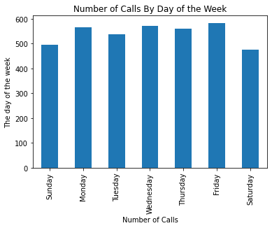
Using pandas, construct a vertical bar plot with the count of the number of calls (entries in the table) for each day of the week ordered by the day of the week (eg. Sunday, Monday, …). Be sure that your axes are labeled and that your plot is titled. There should be approximately 500 calls per day.
Hint: Given a series s, and an array coolIndex that has the same entries as in s.index, s[coolIndex] will return a copy of the series in the same order as coolIndex.
| |
Question 3d
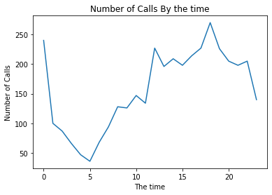
Using pandas, construct a line plot with the count of the number of calls (entries in the table) for each hour of the day ordered by the time (eg. 12:00 AM, 1:00 AM, …). Please use the provided variable hours in your answer. Be sure that your axes are labeled and that your plot is titled.
| |
Question 4
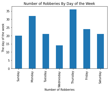
It seems weekdays generally have slightly more calls than Saturday or Sunday, but the difference does not look significant.
We can break down into some particular types of events to see their distribution. For example, let’s make a bar plot for the CVLEGEND “ROBBERY”. Which day is the peak for “ROBBERY”?
Question 4a
Use pandas to create a vertical bar plot of the number of total robberies reported on each day of the week, again ordered by the days of the week starting with Sunday. Please use the provided variable filtered in your answer.
Hint: This should be very similar to Question 3b
| |
Question 5
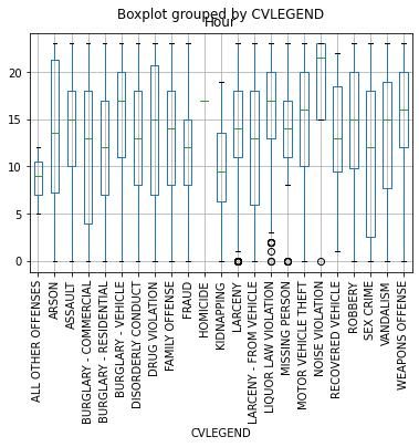
In the cell below, generate a boxplot which examines the hour of day of each crime broken down by the CVLEGEND value. To construct this plot use the DataFrame.boxplot documentation. You may want to rotate the CVLEGEND labels for better readability.
Looking at your plot, which crime type appears to have the largest interquartile range? Put your results into answer5 as a string
| |