Lab01_WriteUp
Contents
Question 1
Question 1a
Write a function summation that evaluates the following summation for $n \geq 1$:
$$\sum_{i=1}^{n} i^3 + 3 i^2$$
| |
Question 1b
Write a function elementwise_list_sum that computes the square of each value in list_1, the cube of each value in list_2, then returns a list containing the element-wise sum of these results. Assume that list_1 and list_2 have the same number of elements.
Hint: The zip function may be useful here.
| |
Question 1c
Recall the formula for population variance below:
$$\sigma^2 = \frac{\sum_{i=1}^N (x_i - \mu)^2}{N}$$
Complete the functions below to compute the population variance of population, an array of numbers. For this question, do not use built in NumPy functions; we will use NumPy to verify your code. Don’t worry if you’re unfamiliar with what NumPy is, we discuss it in the next section.
| |
Question 2
The core of NumPy is the array. Like Python lists, arrays store data; however, they store data in a more efficient manner. In many cases, this allows for faster computation and data manipulation.
In Data 8, we used make_array from the datascience module, but that’s not the most typical way. Instead, use np.array to create an array. It takes a sequence, such as a list or range.
Below, create an array arr containing the values 1, 2, 3, 4, and 5 (in that order)
| |
Question 3
Question 3a
Given the array random_arr, assign valid_values to an array containing all values $x$ such that $2x^4 > 1$.
Note: You should not use for loops in your solution. Instead, look at numpy’s documentation on Boolean Indexing.
| |
Question 3b
Use NumPy to recreate your answer to Question 1b. The input parameters will both be python lists, so you will need to convert the lists into arrays before performing your operations. The output should be a numpy array.
Hint: Use the NumPy documentation. If you’re stuck, try a search engine! Searching the web for examples of how to use modules is very common in data science.
| |
With the larger dataset, we see that using NumPy results in code that executes over 50 times faster! Throughout this course (and in the real world), you will find that writing efficient code will be important; arrays and vectorized operations are the most common way of making Python programs run quickly
Question 4
Consider the function $f(x) = x^2$ for $-\infty < x < \infty$.
Question 4c
Write code to plot the function $f$, the tangent line at $x=8$, and the tangent line at $x=0$.
Set the range of the x-axis to (-15, 15) and the range of the y-axis to (-100, 300) and the figure size to (4,4).
Your resulting plot should look like this:
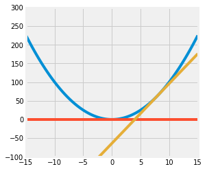
You should use the plt.plot function to plot lines. You may find the following functions useful:
| |
Result: 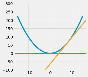
Question 5
Data scientists use coin tossing as a visual image for sampling at random with replacement from a binary population.
Question 5a
A coin that lands heads with chance 0.8 is tossed six times. What is the chance of the sequence HHHTHT? Assign your answer to the variable p_HHHTHT.
| |
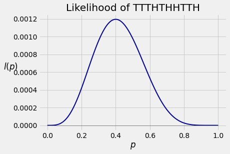
Question 5b
I have a coin that lands heads with an unknown probability $p$. I toss it 10 times and get the sequence TTTHTHHTTH.
If you toss this coin 10 times, the chance that you get the sequence above is a function of $p$. That function is called the likelihood of the sequence TTTHTHHTTH, so we will call it $l$.
Below is the graph of $l$ as a function of $p$ for $p \in [0, 1]$. As we see in the graph, the likelihood of observing TTTHTHHTTH varies as we change the value of $p$. Certain values of $p$ make the sequence more likely than others.
| |
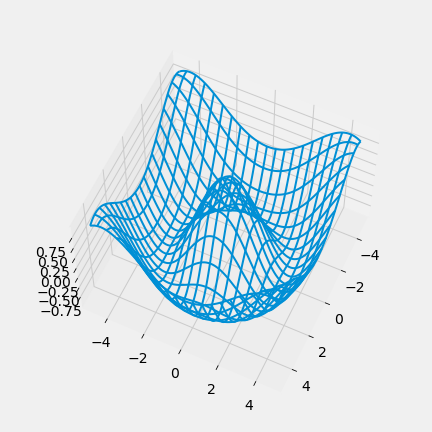
Question 6
Data science is a rapidly expanding field and no degree program can hope to teach you everything that will be helpful to you as a data scientist. So it’s important that you become familiar with looking up documentation and learning how to read it.
Below is a section of code that plots a three-dimensional “wireframe” plot. You’ll see what that means when you draw it. Replace each # Your answer here with a description of what the line above does, what the arguments being passed in are, and how the arguments are used in the function. For example,
| |
Hint: The Shift + Tab tip from earlier in the notebook may help here. Remember that objects must be defined in order for the documentation shortcut to work; for example, all of the documentation will show for method calls from np since we’ve already executed import numpy as np. However, since z is not yet defined in the kernel, z.reshape() will not show documentation until you run the line z = np.cos(squared).
| |
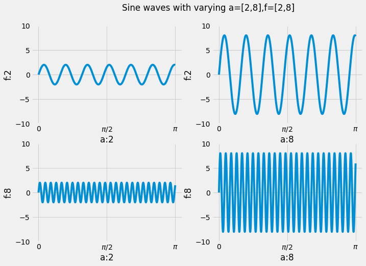
Question 8 (ungraded)
This problem will not be graded, but you should still attempt it! Suppose we want to visualize the function $g(t) = a \cdot \sin(2 \pi f t)$ while varying the values $f, a$. Generate a 2 by 2 plot that plots the function $g(t)$ as a line plot with values $f = 2, 8$ and $a = 2, 8$. Since there are 2 values of $f$ and 2 values of $a$ there are a total of 4 combinations, hence a 2 by 2 plot. The rows should vary in $f$ and the columns should vary in $a$.
Set the x limit of all figures to $[0, \pi]$ and the y limit to $[-10, 10]$. The figure size should be 8 by 8. Make sure to label your x and y axes with the appropriate value of $f$ or $a$. Additionally, make sure the x ticks are labeled $[0, \frac{\pi}{2}, \pi]$. Your overall plot should look something like this:
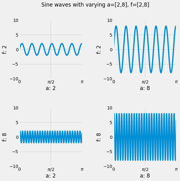
Hint 1: Modularize your code and use loops.
Hint 2: Are your plots too close together such that the labels are overlapping with other plots? Look at the plt.subplots_adjust function.
Hint 3: Having trouble setting the x-axis ticks and ticklabels? Look at the plt.xticks function.
Hint 4: You can add title to overall plot with plt.suptitle.
| |